About
Simonica wasn’t a beginning. It was a continuation.
The Chkheidze family had been making wine in Georgia’s Imereti region for generations—founded by Simon, carried on by his sons, and now led by Nini, his granddaughter. The vineyard, the cellar, the wines were all there—estate-grown, crafted with care, and even reviving nearly-forgotten Georgian grape varieties. What Nini needed was an identity that could carry everything forward—without losing what mattered.
The name came from memory: “Simonica,” a familiar nickname once used for Simon in the region. Georgian, personal, and already theirs.
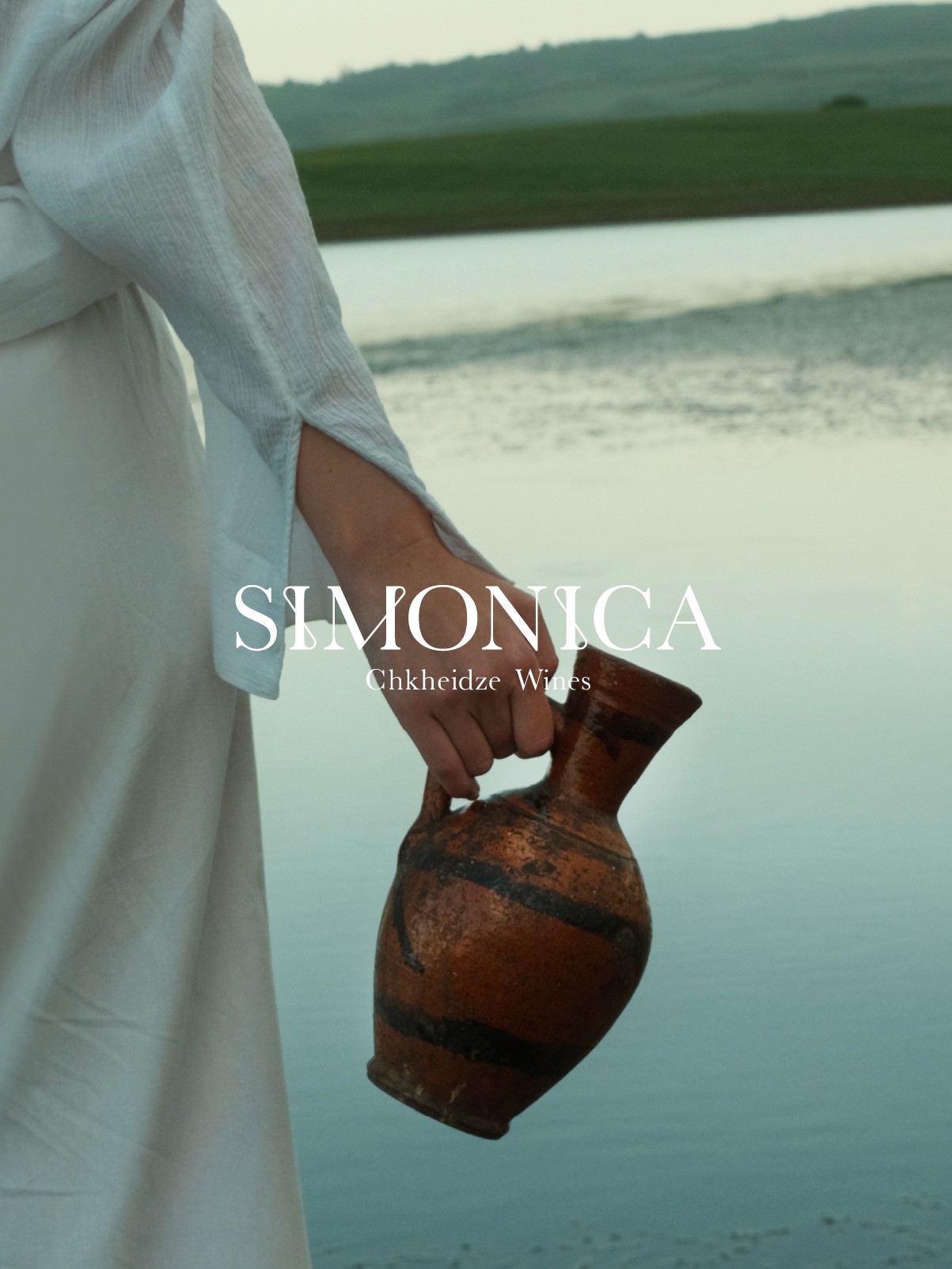
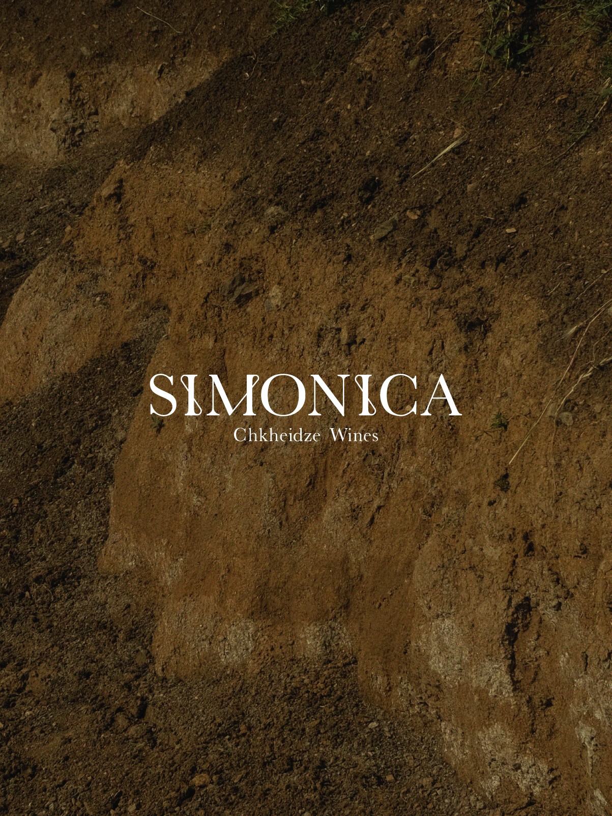
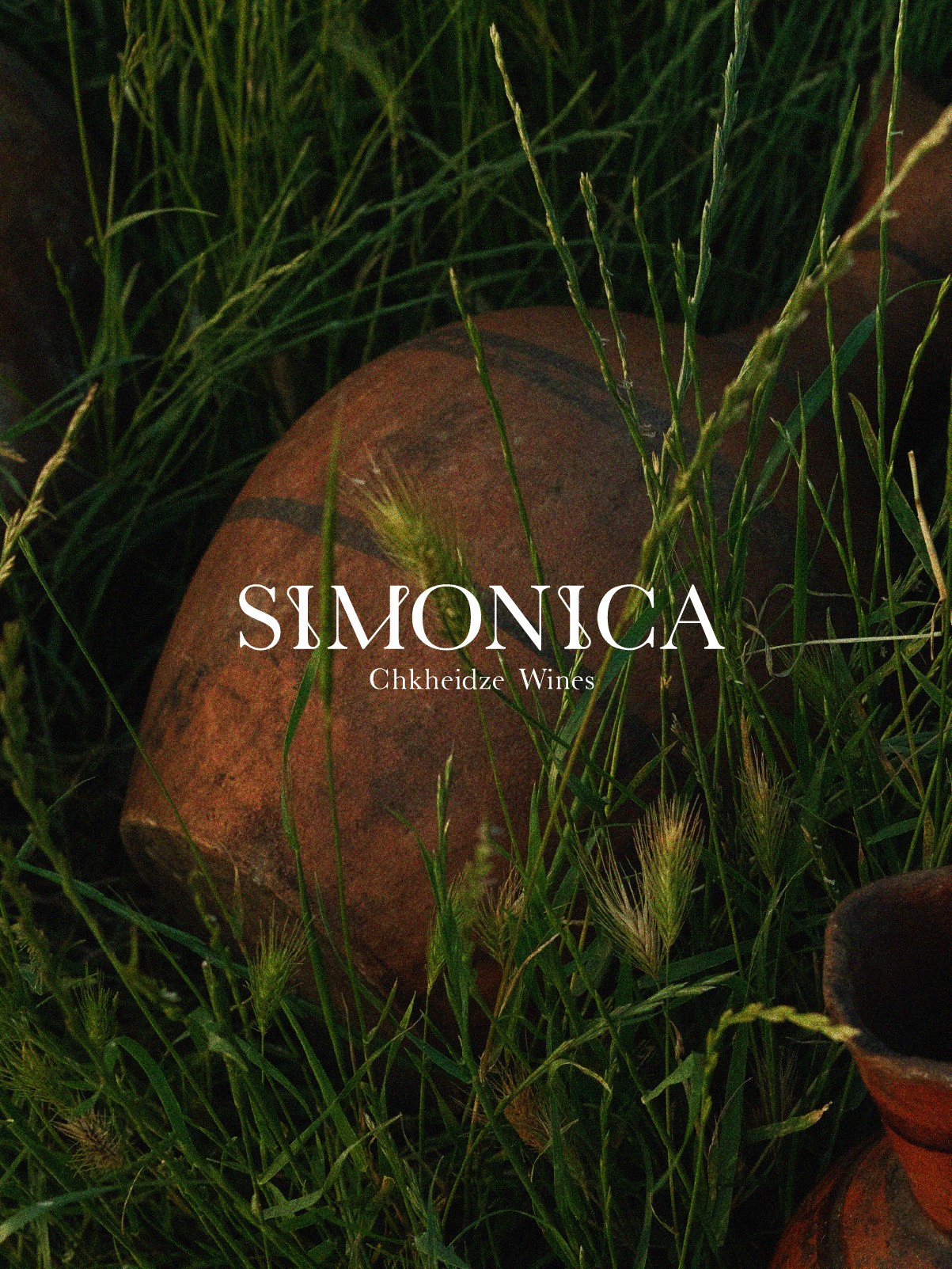
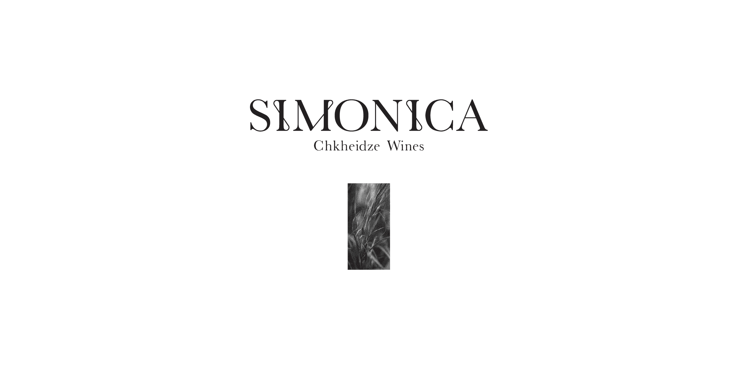
We started with the land—not as a backdrop, but as the character of the wine itself. With a desire to express the purity and the intimate connection between the wine, its maker, and its origin. To create the feeling of being there. Among the vines, the qvevris, the rocks and leaves and water. We gave each bottle a single piece from that world. Something real, seen and touched. A piece of the place these wines come from.
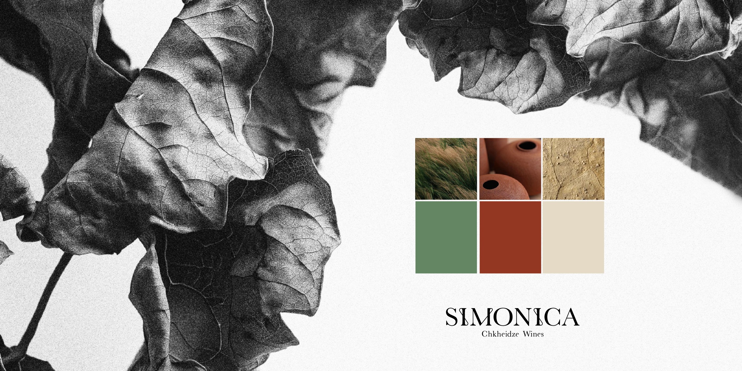
The labels were designed as fragments of the same landscape. Together, they bring the vineyard into view—quietly evoking the feeling of standing there, surrounded by what makes this wine what it is.
The colors also were chosen to belong: qvevri clay, sun-warmed wood, soft green, pale leaves, and earth.
This identity doesn’t imitate origin—it comes from it. That’s how Simonica ended up looking exactly like where it came from.
Visual Identity, Photography Direction and Production
For
Simonica
Category
Visual Identity
Year
2024